


1
2
3
4
5
6
7
8

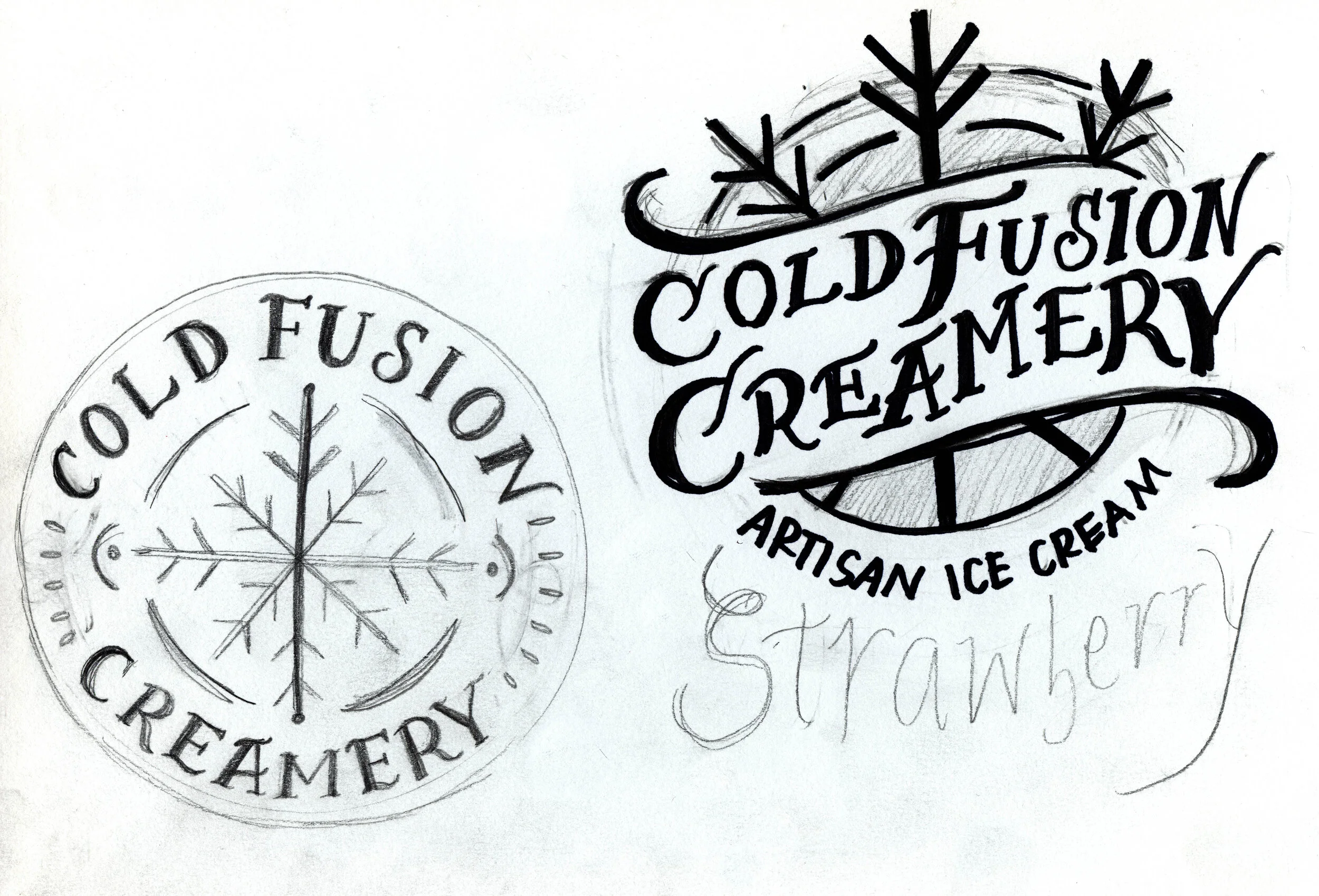
The objective for this project as to create a logo and package design for a high-end ice cream producer. I was given a “buzzword” which represented something a client may say/suggest when explaining what they’d like from the design. My randomly chosen buzzword was “vintage”. I felt that something that truly exemplified vintage, especially in packaging, was hand lettering. With that in mind, I went with a hand drawn type approach for the logo and the packaging to keep the brand consistent and unified.
In order to show how I came to some of these solutions, I’ve included some of my process work for the project.